

Again, with you
After leading the digital transformation, we face a new challenge: to evolve with a new positioning that redefines our relationship with people. Not only through technology, but in how we communicate, how we design, and how we present ourselves. Because moving forward with them is what has always motivated us. In today's decisions. In tomorrow's projects.
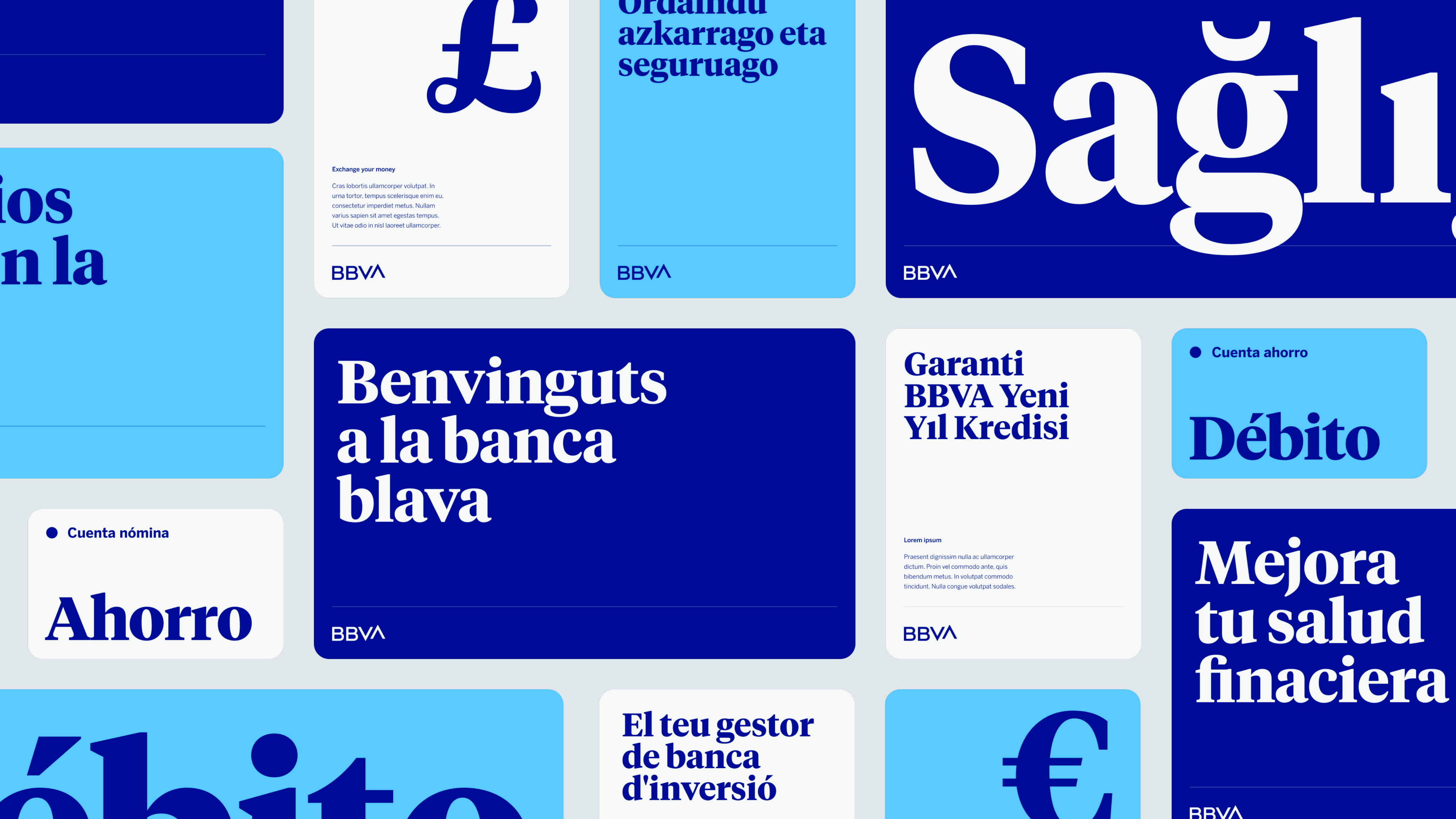
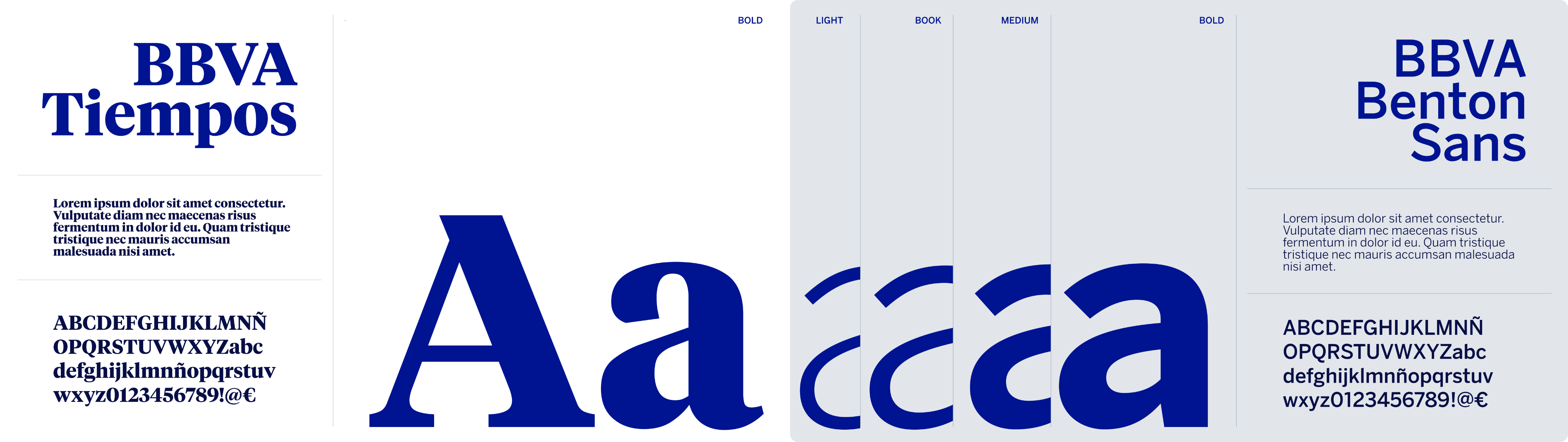
New type, new character
BBVA Times is our new typography. Custom designed to reflect who we are: more legible, more open, more secure. Because every letter also carries meaning.
Colour with purpose
Our palette has evolved to express a banking that feels more human and grounded. Tones that bring clarity, contrasts that create connection, and an electric blue that continues to lead the way.
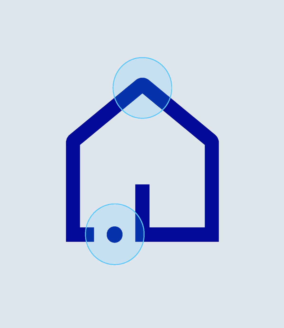
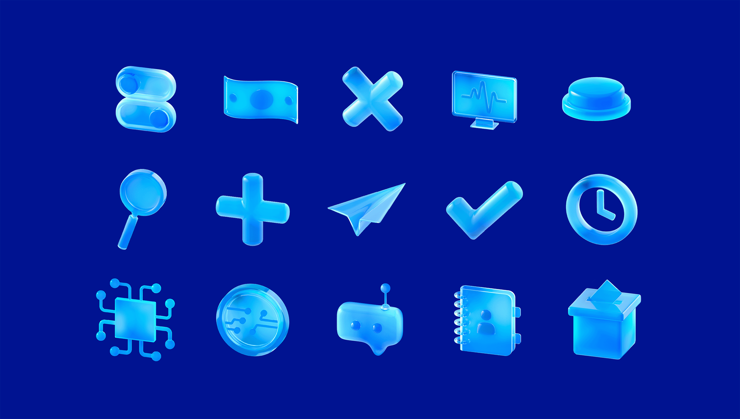
Icons that communicate clearly
A new icon family designed for clarity and closeness. Simple, precise, universally readable. Good communication doesn't need to be complicated.
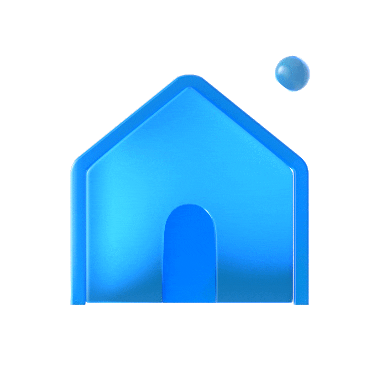
Micro-illustrations, real impact
A new family of micro-illustrations designed to explain without overcomplicating and to add warmth without noise. Functional, expressive, and built for real use.
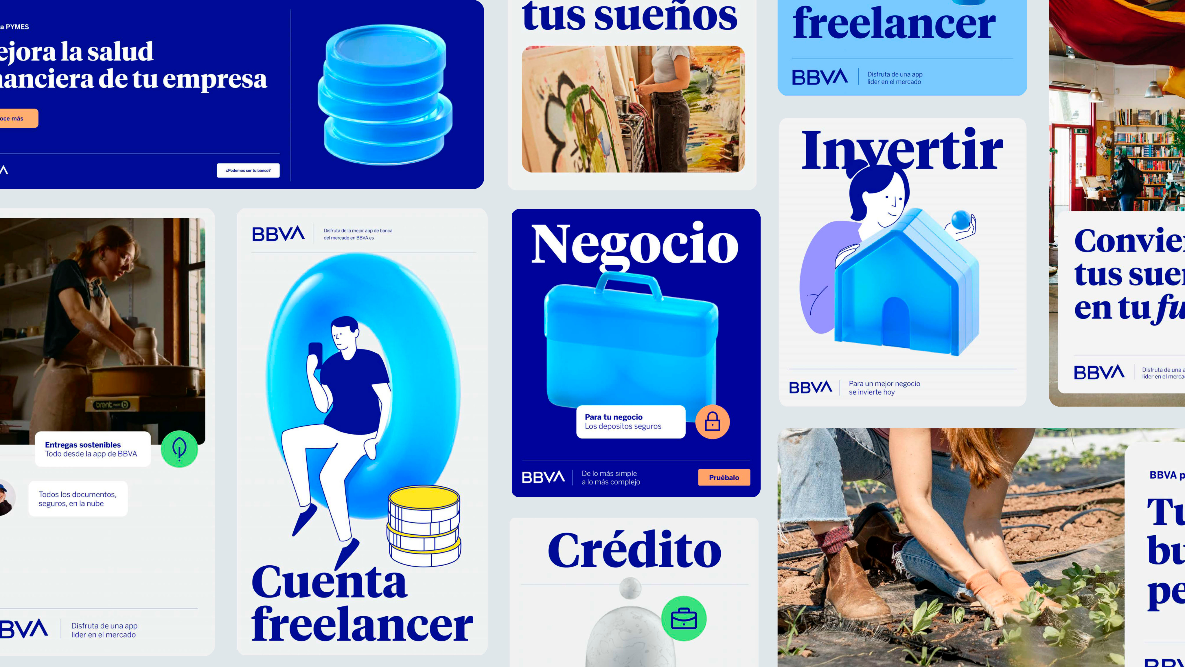
Illustrations that do the work
Our illustrations organise, connect, and bring coherence to the experience. Versatile and functional, they are designed to support content, not decorate it.
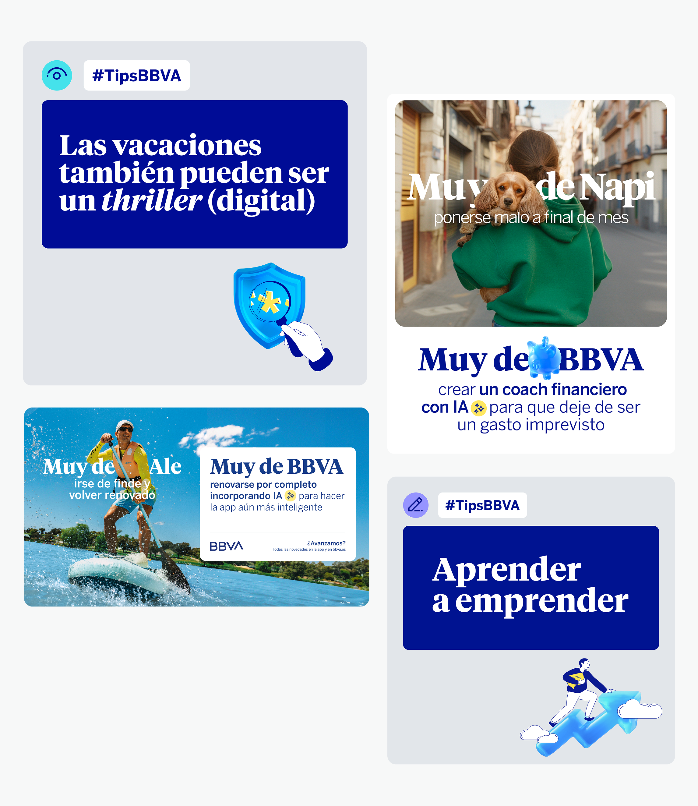
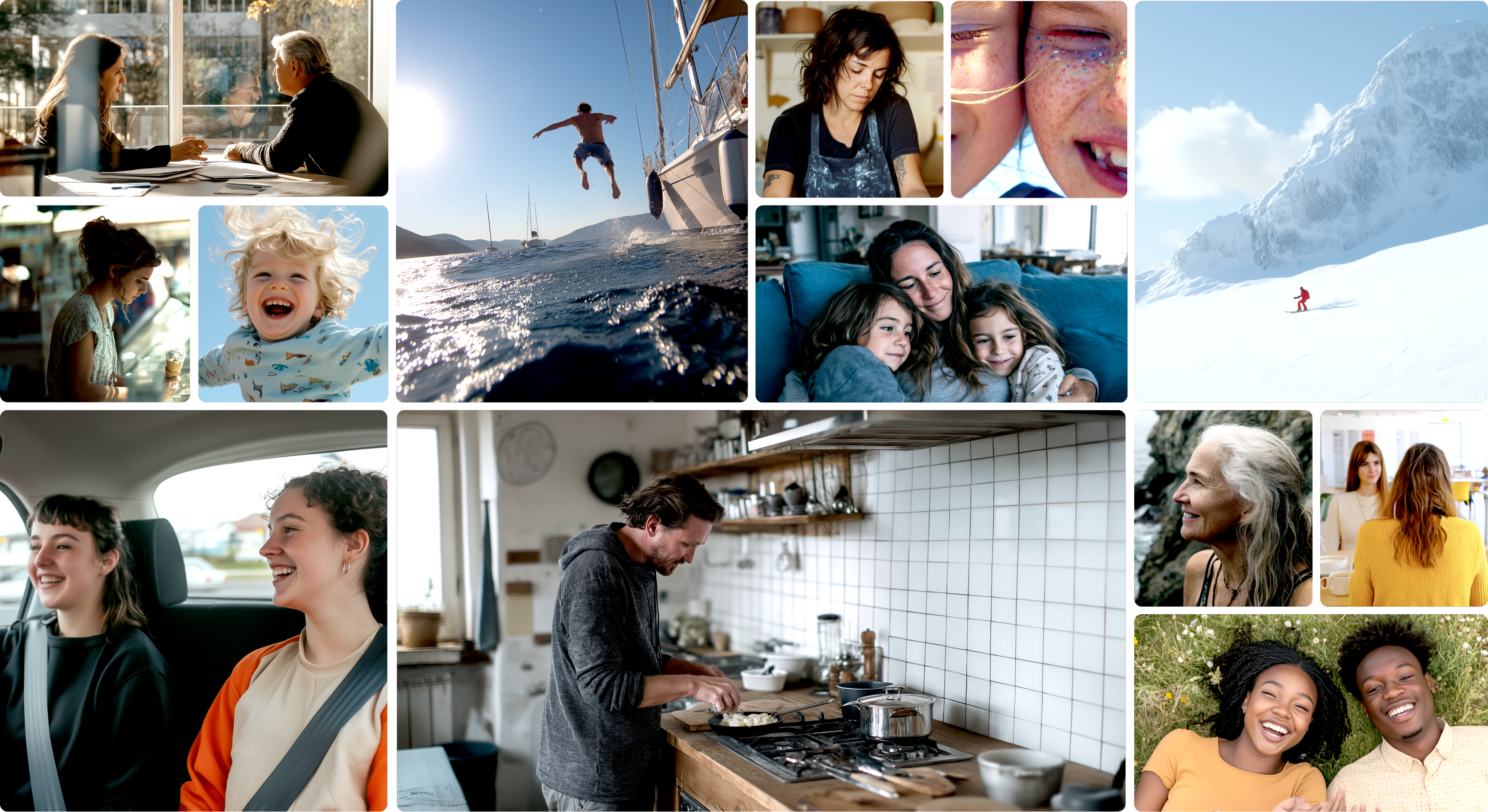
Photography that's honest
We created an authentic and close photographic style. More real. More human. More ours. Images that tell stories, not pose for them.

A voice that tunes in to listen
Every word is chosen with intention: to be there, to solve, to resonate. Because showing up isn't enough. It means listening, understanding, and acting.
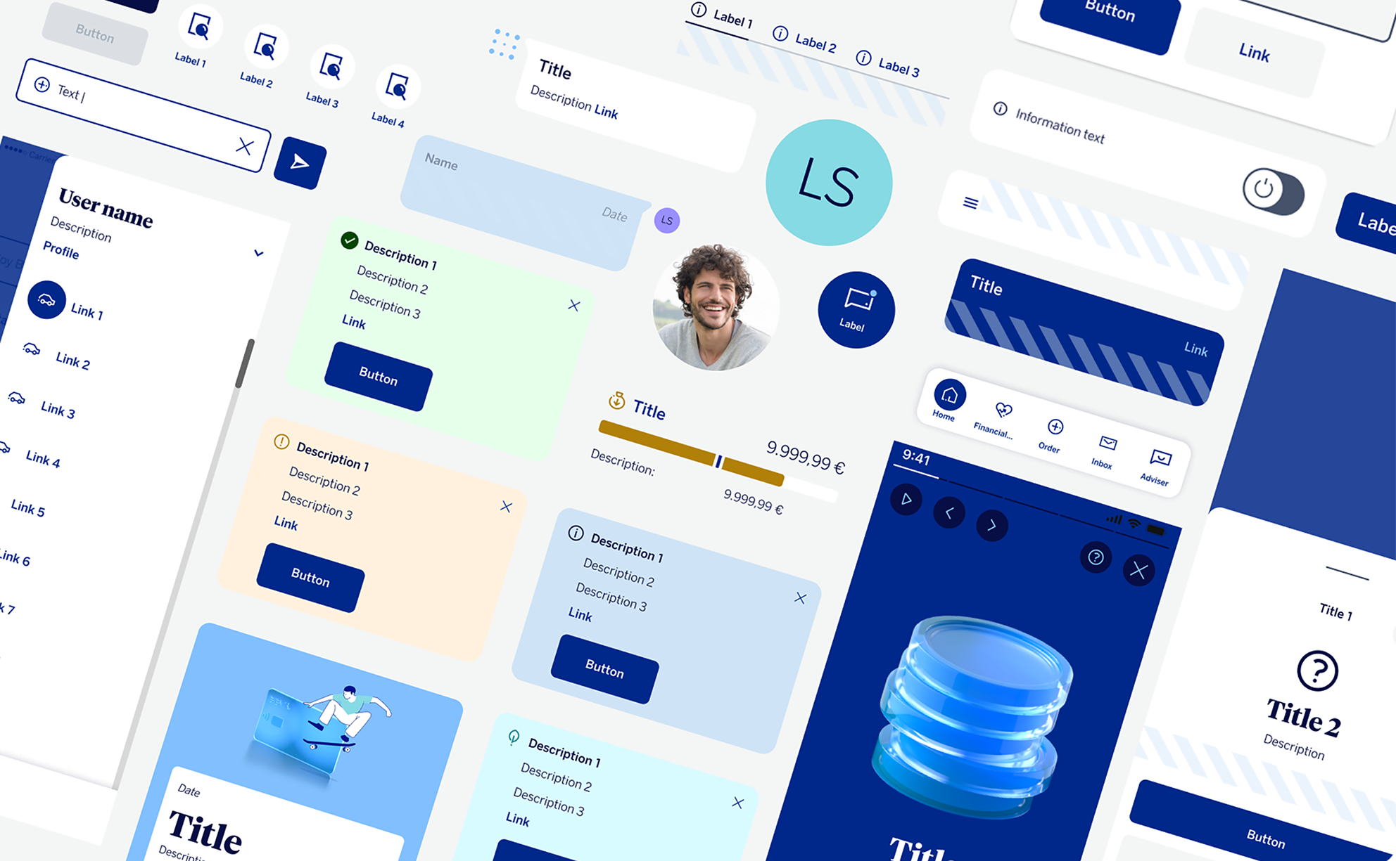
A design system that's alive
Our design system is modular, flexible, and built to grow. It creates coherence without limiting creativity, and turns every touchpoint into an opportunity to guide, connect and improve the experience.
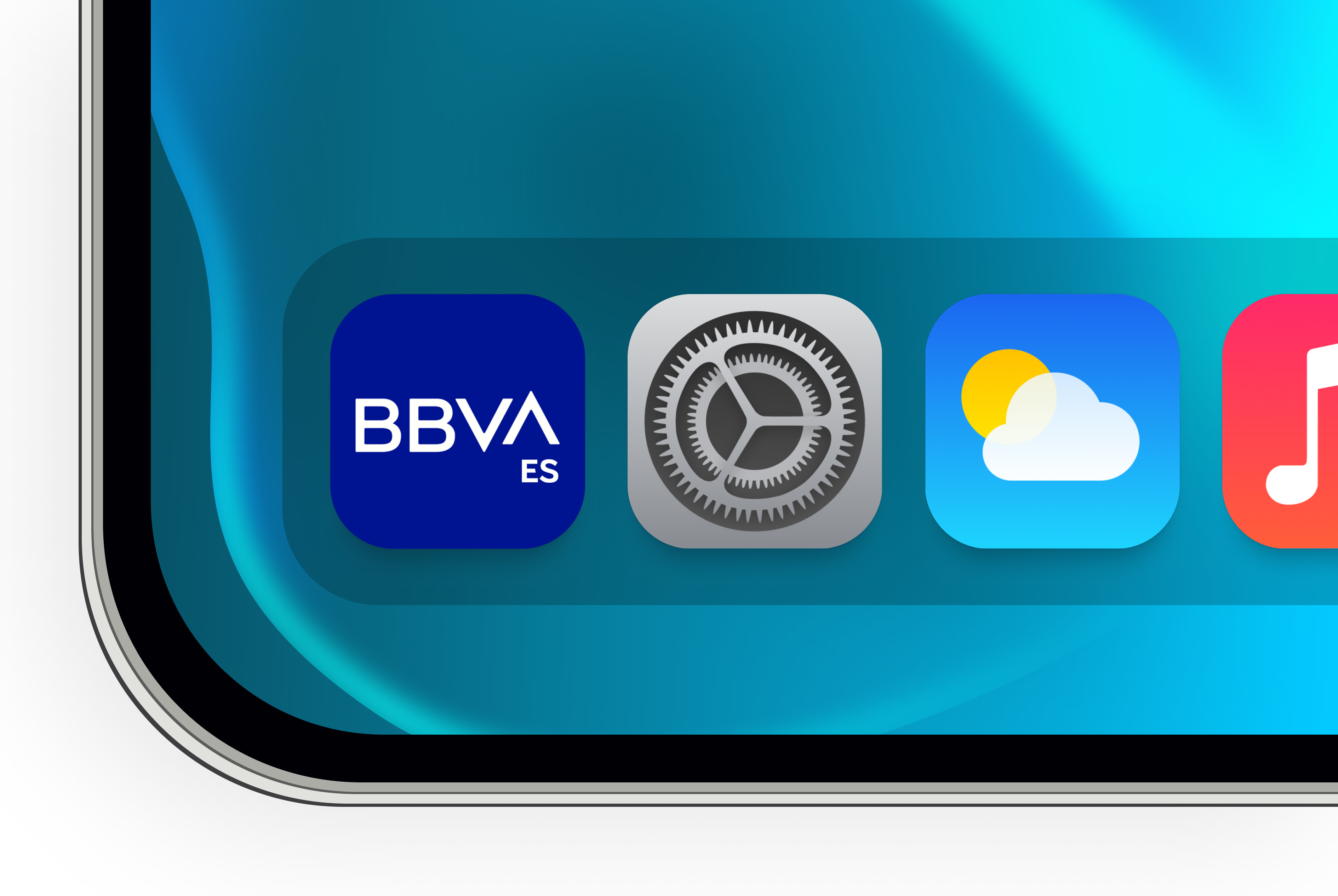
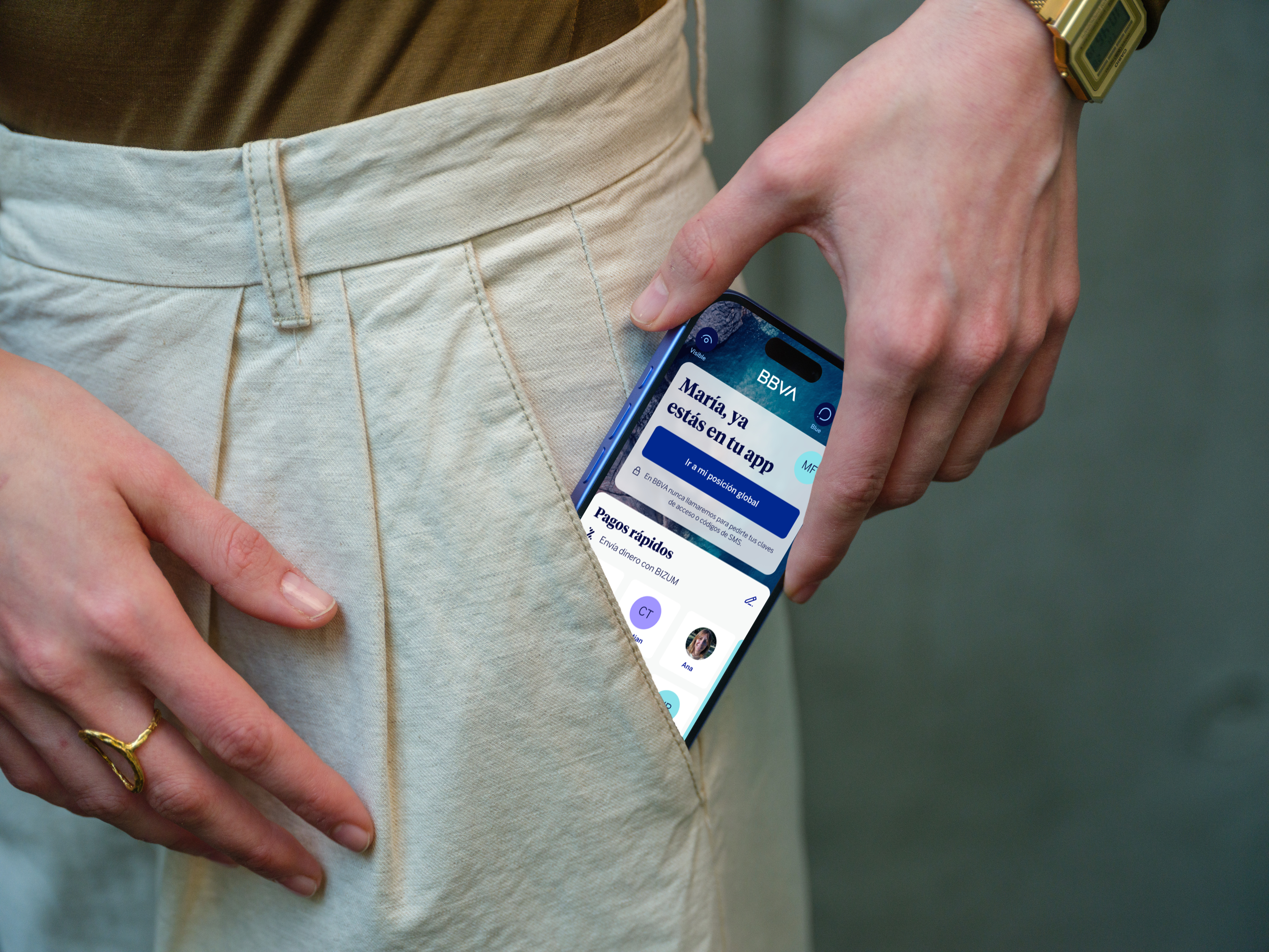
An app that works for you
The new BBVA app is more than a tool, it's a guide. It gives you control, anticipates your needs, and adapts to how you work. Designed to help you make decisions with confidence and without friction.
The future is just the beginning.
Shall we move forward?

Again, with you
After leading the digital transformation, we face a new challenge: to evolve with a new positioning that redefines our relationship with people. Not only through technology, but in how we communicate, how we design, and how we present ourselves. Because moving forward with them is what has always driven us. In today's decisions. In tomorrow's projects.
New type, new character
BBVA Times is our new typeface, designed from scratch to reflect who we are: more legible, more open, more confident. Typography that doesn't just carry words, it carries meaning
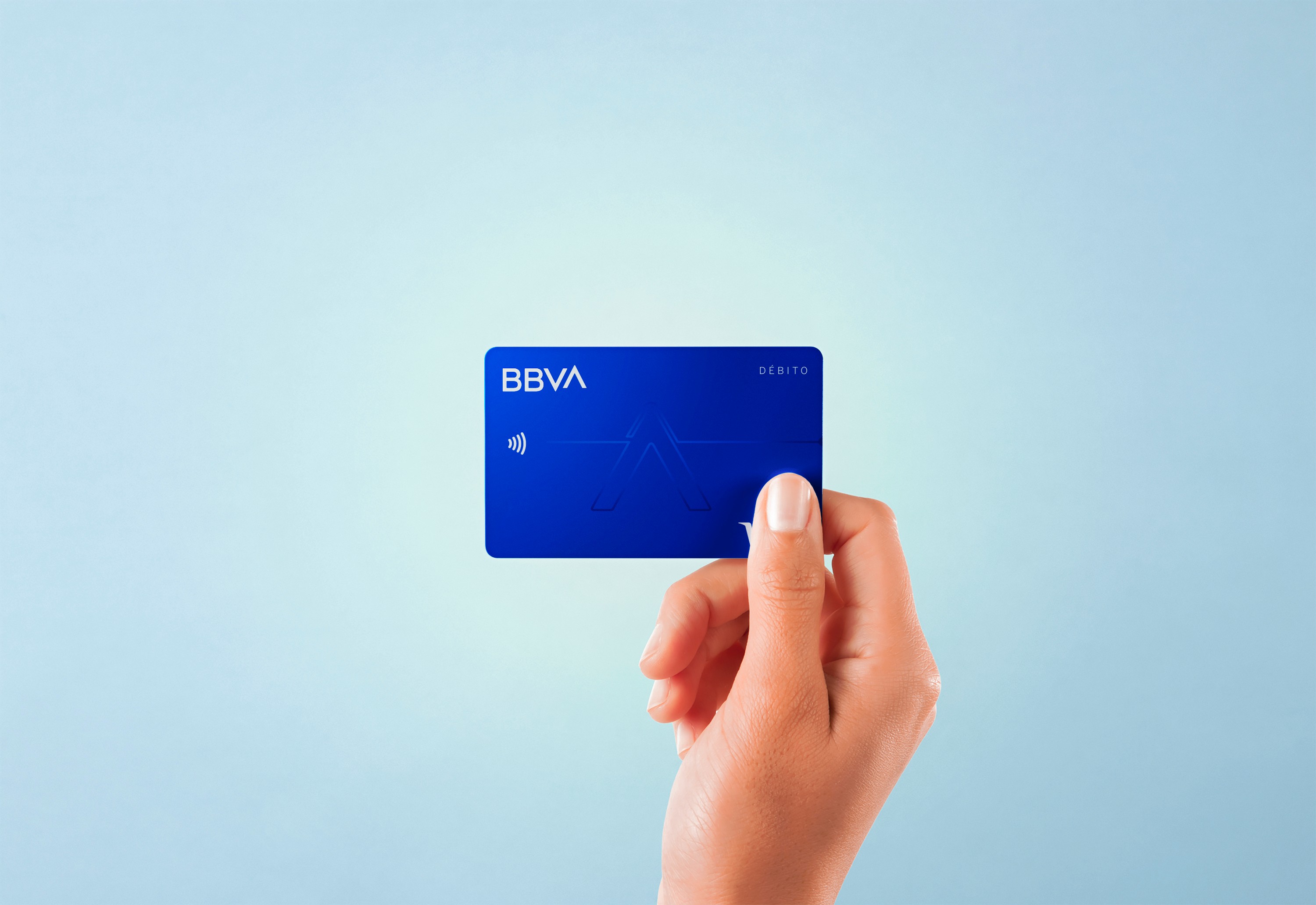
Colour with purpose
Our palette has evolved to express a banking that feels more human and grounded. Tones that bring clarity, contrasts that create connection, and an electric blue that continues to lead the way.
Icons that communicate clearly
A new icon family designed for clarity and closeness. Simple, precise, universally readable. Good communication doesn't need to be complicated.
Micro-illustrations, real impact
A new family of micro-illustrations designed to explain without overcomplicating and to add warmth without noise. Functional, expressive, and built for real use.
Illustrations that do the work
Our illustrations organise, connect, and bring coherence to the experience. Versatile and functional, they are designed to support content, not decorate it.
Photography that's honest
We created an authentic and close photographic style. More real. More human. More ours. Images that tell stories, not pose for them.
A voice worth listening to
Every word is chosen with intention: to be there, to solve, to resonate. Because showing up isn't enough. It means listening, understanding, and acting.
A design system that's alive
Our design system is modular, flexible, and built to grow. It creates coherence without limiting creativity, and turns every touchpoint into an opportunity to guide, connect and improve the experience.
An app that works for you
The new BBVA app is more than a tool, it's a guide. It gives you control, anticipates your needs, and adapts to how you work. Designed to help you make decisions with confidence and without friction.
The future is just the beginning.
Shall we move forward?
Again, with you
Leading the digital transformation was just the beginning. Now we face a new challenge: evolving how we show up, how we speak, how we design, and how we connect with people. This new chapter isn't just a visual update. It's a commitment to moving forward together.
New type, new character
BBVA Times is our new typeface, designed from scratch to reflect who we are: more legible, more open, more confident. Typography that doesn't just carry words, it carries meaning
Colour with purpose
Our palette has evolved to express a banking that feels more human and grounded. Tones that bring clarity, contrasts that create connection, and an electric blue that continues to lead the way.
Icons that communicate clearly
A new icon family designed for clarity and closeness. Simple, precise, universally readable. Good communication doesn't need to be complicated.
Micro-illustrations, real impact
A new family of micro-illustrations designed to explain without overcomplicating and to add warmth without noise. Functional, expressive, and built for real use.
Illustrations that do the work
Our illustrations organise, connect, and bring coherence to the experience. Versatile and functional, they are designed to support content, not decorate it.
Photography that's honest
We created an authentic and close photographic style. More real. More human. More ours. Images that tell stories, not pose for them.
A voice worth listening to
Every word is chosen with intention: to be there, to solve, to resonate. Because showing up isn't enough. It means listening, understanding, and acting.
With a new design system, created to evoke emotions
Our new design system is alive. It is modular, flexible, and evolves with each need of the people. It drives coherence without limiting creativity, and turns every touchpoint into an opportunity to evoke, guide, and accompany.
An app that works for you
The new BBVA app is more than a tool, it's a guide. It gives you control, anticipates your needs, and adapts to how you work. Designed to help you make decisions with confidence and without friction.
The future is just the beginning.
Shall we move forward?
Again, with you
After leading the digital transformation, we face a new challenge: to evolve with a new positioning that redefines our relationship with people. Not just from technology, but from how we speak, how we design, and how we are present. Because moving forward with them is what has always driven us. In today's decisions. In tomorrow's projects.
New type, new character
BBVA Times is our new typeface, designed from scratch to reflect who we are: more legible, more open, more confident. Typography that doesn't just carry words, it carries meaning
Colour with purpose
Our palette has evolved to express a banking that feels more human and grounded. Tones that bring clarity, contrasts that create connection, and an electric blue that continues to lead the way.
Icons that communicate clearly
A new icon family designed for clarity and closeness. Simple, precise, universally readable. Good communication doesn't need to be complicated.
Micro-illustrations, real impact
A new family of micro-illustrations designed to explain without overcomplicating and to add warmth without noise. Functional, expressive, and built for real use.
Illustrations that do the work
Our illustrations organise, connect, and bring coherence to the experience. Versatile and functional, they are designed to support content, not decorate it.
Photography that's honest
We created an authentic and close photographic style. More real. More human. More ours. Images that tell stories, not pose for them.
A voice worth listening to
Every word is chosen with intention: to be there, to solve, to resonate. Because showing up isn't enough. It means listening, understanding, and acting.
A design system that's alive
Our design system is modular, flexible, and built to grow. It creates coherence without limiting creativity, and turns every touchpoint into an opportunity to guide, connect and improve the experience.
An app that works for you
The new BBVA app is more than a tool, it's a guide. It gives you control, anticipates your needs, and adapts to how you work. Designed to help you make decisions with confidence and without friction.
The future is just the beginning.
Shall we move forward?
Again, with you
Leading the digital transformation was just the beginning. Now we face a new challenge: evolving how we show up, how we speak, how we design, and how we connect with people. This new chapter isn't just a visual update. It's a commitment to moving forward together.
New type, new character
BBVA Times is our new typeface, designed from scratch to reflect who we are: more legible, more open, more confident. Typography that doesn't just carry words, it carries meaning
Colour with purpose
Our palette has evolved to express a banking that feels more human and grounded. Tones that bring clarity, contrasts that create connection, and an electric blue that continues to lead the way.
Icons that communicate clearly
A new icon family designed for clarity and closeness. Simple, precise, universally readable. Good communication doesn't need to be complicated.
Micro-illustrations, real impact
A new family of micro-illustrations designed to explain without overcomplicating and to add warmth without noise. Functional, expressive, and built for real use.
Illustrations that do the work
Our illustrations organise, connect, and bring coherence to the experience. Versatile and functional, they are designed to support content, not decorate it.
Photography that's honest
A photographic style that favours authenticity over polish. Real people, real moments, real stories. Images that reflect life as it's actually lived.
A voice worth listening to
Every word is chosen with intention: to be there, to solve, to resonate. Because showing up isn't enough. It means listening, understanding, and acting.
A design system that's alive
Our design system is modular, flexible, and built to grow. It creates coherence without limiting creativity, and turns every touchpoint into an opportunity to guide, connect and improve the experience.
An app that works for you
The new BBVA app is more than a tool, it's a guide. It gives you control, anticipates your needs, and adapts to how you work. Designed to help you make decisions with confidence and without friction.
The future is just the beginning.
Shall we move forward?